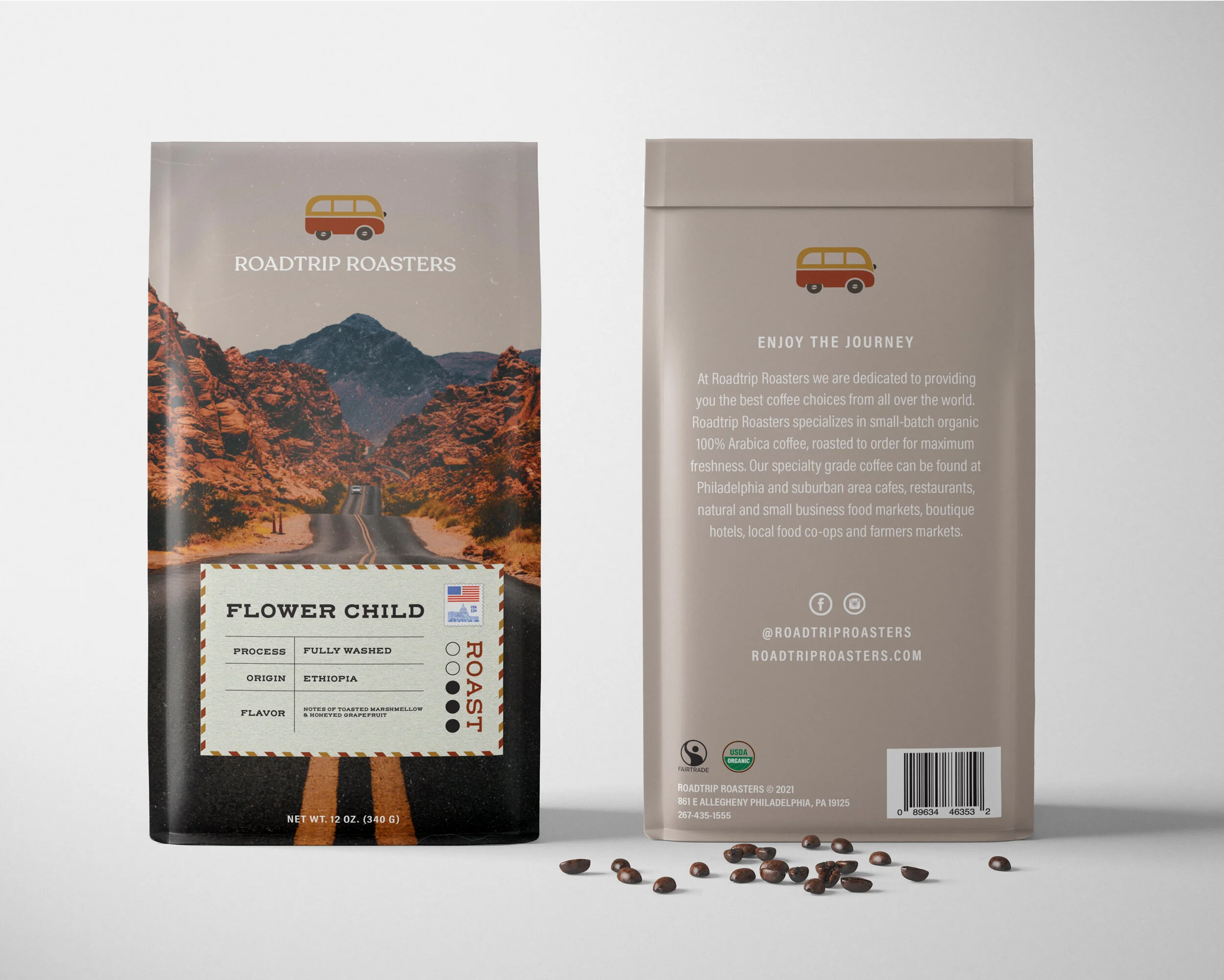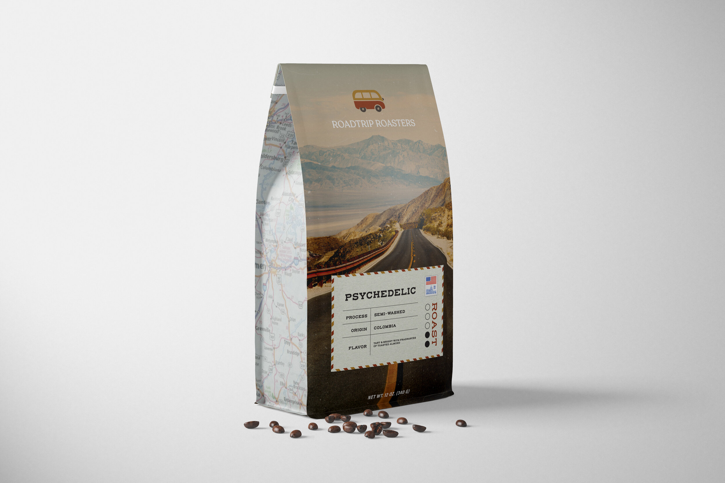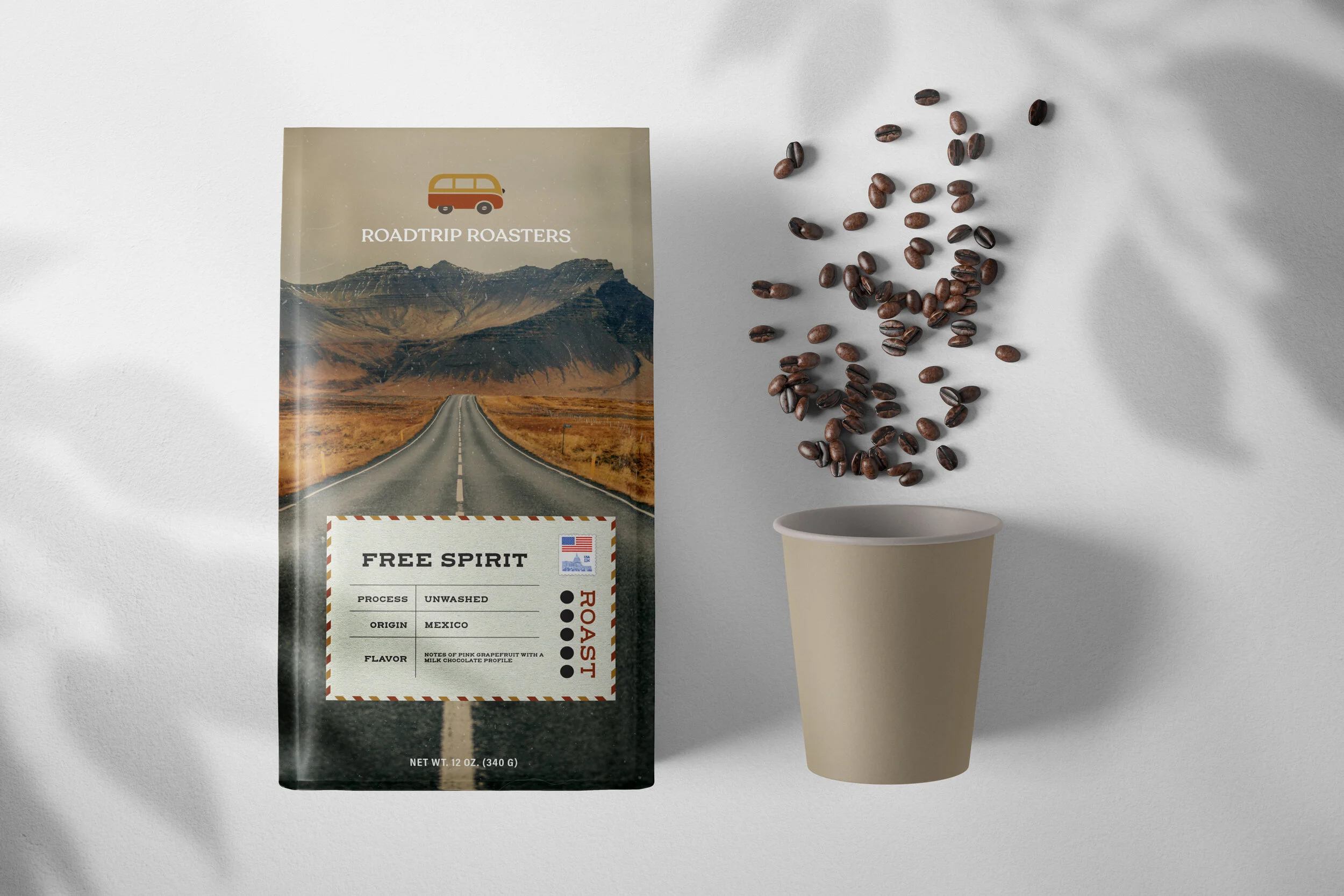
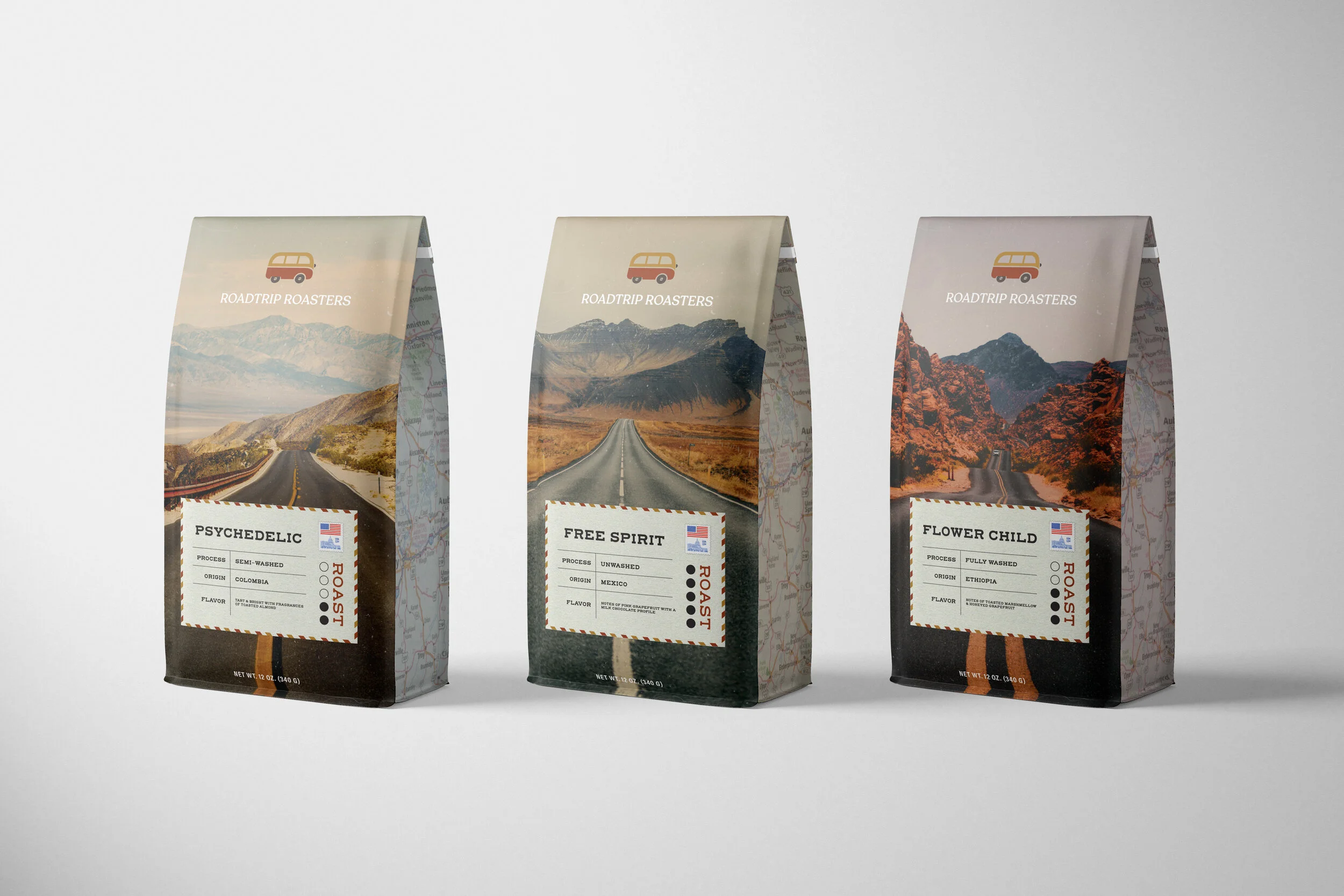
ROADTRIP ROASTERS
This coffee packaging utilizes an innovative combination of a roadtrip theme and elements from the 1970's to create a distinctive brand identity known as Roadtrip Roasters. Drawing inspiration from older Volkswagen vans, the logo was designed to resonate with the era of 1970's typography. Additionally, the background pictures are edited to emulate the feel of film photography, while the names of the coffees evoke themes prevalent during the same period. The imagery used throughout the packaging effectively captures the spirit of roadtrips, featuring scenes one might encounter on such journeys. The postcard displaying key information about the coffee serves to reinforce this theme. Maps on either side of the packaging merge everything together cohesively and accentuate the central motif of the roadtrip.