
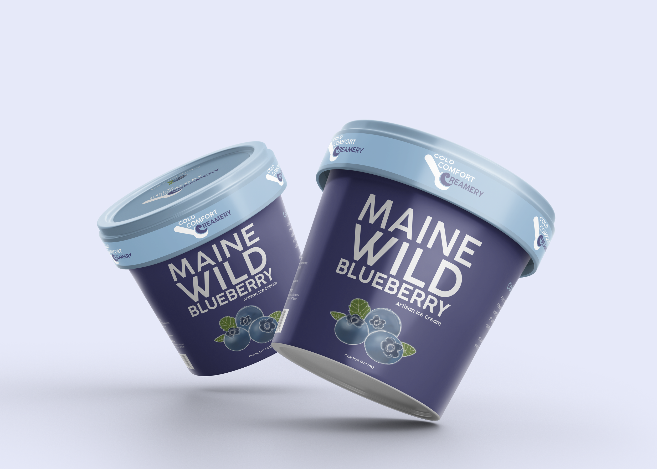
COLD COMFORT CREAMERY
For this project, I had to create a logo for the ice cream company Cold Comfort Creamery, as well as design a pint of ice cream for one of their several flavors. For the logo, I used the curve of the C in “Creamery” and related it back to ice cream. I designed the C to look like ice cream that was being scooped out with an ice cream scoop. For the packaging, I received a “buzz word” that I had to incorporate into the design of the packaging. My buzz word was powerful, and I wanted to design something that was clean and minimalistic because there is power in simplicity. This was the end result!